Material AppBar Widget Tutorial
A material design app bar. App bars are typically used in the Scaffold.appBar property, which places the app bar as a fixed-height widget at the top of the screen. The AppBar displays the toolbar widgets, leading, title, and actions, above the bottom (if any).
Material AppBar Widget useful Inputs
-
title: The primary widget displayed in the app bar.
-
leading: A widget to display before the toolbar’s title.
-
centerTitle: Whether the title should be centered.
-
backgroundColor: The fill color to use for an app bar’s Material.
-
actions: A list of Widgets to display in a row after the title widget.
Material AppBar Widget example
AppBar(
  title: Text("Bismillah App"),
)
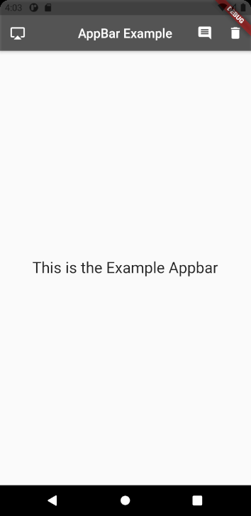
AppBar(
title: const Text('AppBar Example'),
leading: IconButton(
onPressed: () {},
icon: Icon(Icons.airplay),
),
centerTitle: true,
backgroundColor: Colors.black54,
actions: <Widget>[
IconButton(
onPressed: () {},
icon: Icon(Icons.comment),
),
IconButton(
onPressed: () {},
icon: Icon(Icons.delete),
),
],
)Full codes example
import 'package:flutter/material.dart';

void main() => (runApp(AppbarExample()));

class AppbarExample extends StatelessWidget {
  @override
  Widget build(BuildContext context) {
    return MaterialApp(
      home: Scaffold(
        appBar: AppBar(
          title: const Text('AppBar Example'),
          leading: IconButton(
            onPressed: () {},
            icon: Icon(Icons.airplay),
          ),
          centerTitle: true,
          backgroundColor: Colors.black54,
          actions: <Widget>[
            IconButton(
              onPressed: () {},
              icon: Icon(Icons.comment),
            ),
            IconButton(
              onPressed: () {},
              icon: Icon(Icons.delete),
            ),
          ],
        ),
        body: const Center(
          child: Text(
            'This is the Example Appbar',
            style: TextStyle(fontSize: 24),
          ),
        ),
      ),
    );
  }
}