Bootstrap Placeholder
Use loading placeholders for components or pages to indicate something may still be loading.
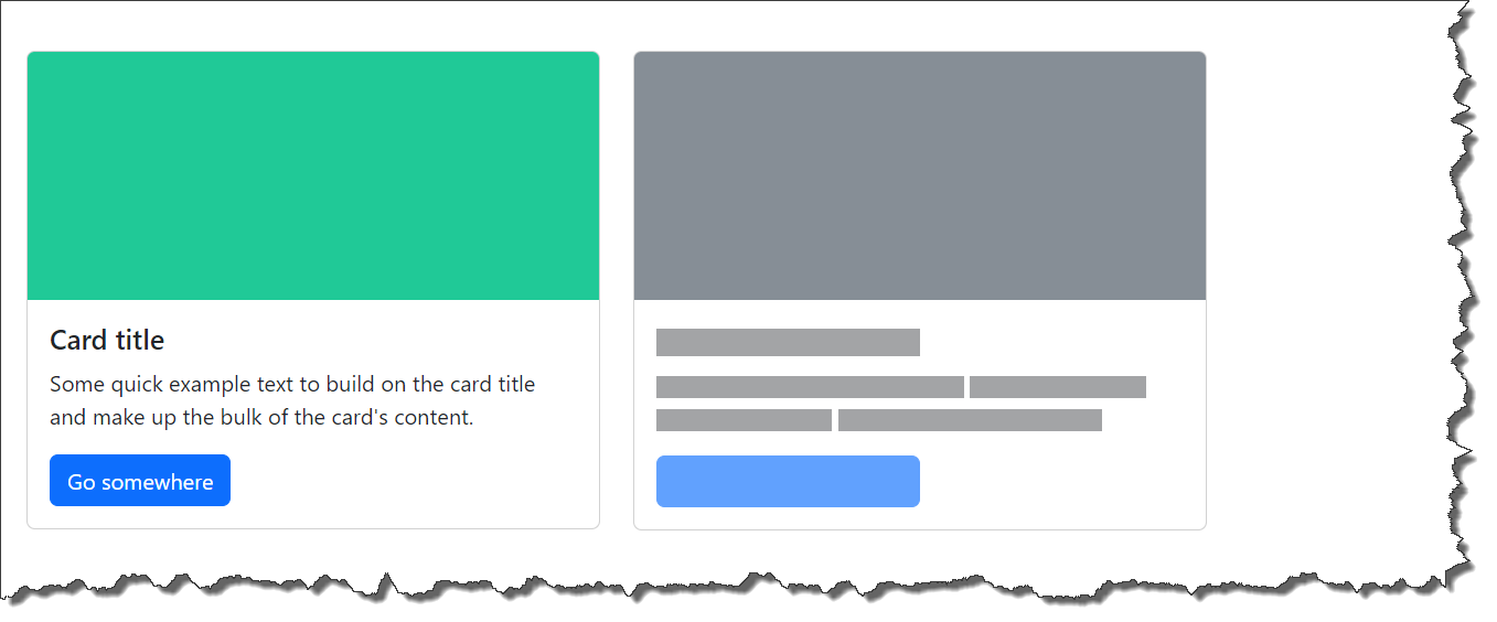
Bootstrap placeholder example
-
Documentation URL : https://getbootstrap.com/docs/5.3/components/placeholders/#example
-
Code Snippet :
<div class="row">
    <div class="col-md-4">
        <div class="card">
            <svg class="bd-placeholder-img card-img-top" width="100%" height="180" xmlns="http://www.w3.org/2000/svg" role="img" aria-label="Placeholder" preserveAspectRatio="xMidYMid slice" focusable="false">
                <title> Placeholder</title>
                <rect width="100%" height="100%" fill="#20c997"></rect>
            </svg>
            <div class="card-body">
                <h5 class="card-title">Card title</h5>
                <p class="card-text">
                    Some quick example text to build on the card title and make up the bulk of the card's content.
                </p>
                <a href="#" class="btn btn-primary">Go somewhere</a>
            </div>
        </div>
    </div>
    <div class="col-md-4">
        <div class="card">
            <svg class="bd-placeholder-img card-img-top" width="100%" height="180" xmlns="http://www.w3.org/2000/svg"
                 role="img" aria-label="Placeholder" preserveAspectRatio="xMidYMid slice" focusable="false">
                <title>Placeholder</title>
                <rect width="100%" height="100%" fill="#868e96"></rect>
            </svg>
            <div class="card-body">
                <div class="h5 card-title placeholder-glow">
                    <span class="placeholder col-6"></span>
                </div>
                <p class="card-text placeholder-glow">
                    <span class="placeholder col-7"></span>
                    <span class="placeholder col-4"></span>
                    <span class="placeholder col-4"></span>
                    <span class="placeholder col-6"></span>
                </p>
                <a class="btn btn-primary disabled placeholder col-6"></a>
            </div>
        </div>
    </div>
</div>-
Output :
Bootstrap simple placeholder
-
Documentation URL : https://getbootstrap.com/docs/5.3/components/placeholders/#how-it-works
-
Code Snippet :
<p>
  <span class="placeholder col-6"></span>
</p>
<a class="btn btn-primary disabled placeholder col-4"></a>-
Here
-
placeholder : Used for placeholder
-
col-6 : Width of the placeholder
-
disabled : Disabled element
-
-
Output :

Bootstrap placeholder width
-
Documentation URL : https://getbootstrap.com/docs/5.3/components/placeholders/#width
-
Code Snippet :
<span class="placeholder col-6"></span>
<span class="placeholder w-75"></span>
<span class="placeholder" style="width: 25%;"></span>-
Output :

Bootstrap placeholder color
-
Documentation URL : https://getbootstrap.com/docs/5.3/components/placeholders/#color
-
Code Snippet :
<span class="placeholder col-12"></span>
<span class="placeholder col-6 bg-primary"></span>
<span class="placeholder col-8 bg-secondary"></span>
<span class="placeholder col-9 bg-success"></span>
<span class="placeholder col-11 bg-danger"></span>
<span class="placeholder col-5 bg-warning"></span>
<span class="placeholder col-8 bg-info"></span>
<span class="placeholder col-6 bg-dark"></span>
<span class="placeholder col-9 bg-light"></span>-
Output :

Bootstrap placeholder size
-
Documentation URL : https://getbootstrap.com/docs/5.3/components/placeholders/#sizing
-
Code Snippet :
<span class="placeholder col-12 placeholder-lg"></span>
<span class="placeholder col-12"></span>
<span class="placeholder col-12 placeholder-sm"></span>
<span class="placeholder col-12 placeholder-xs"></span>-
Here
-
placeholder-lg : Large
-
placeholder-sm : Small
-
placeholder-xs : Extra small
-
-
Output :

Bootstrap placeholder animation
-
Documentation URL : https://getbootstrap.com/docs/5.3/components/placeholders/#animation
-
Code Snippet :
<p class="placeholder-glow">
    <span class="placeholder col-12"></span>
</p>

<p class="placeholder-wave">
    <span class="placeholder col-12"></span>
</p>-
Output :