Bootstrap Button Component
Bootstrap provides a range of classes to style buttons in different ways. These classes can be used to create various button styles and sizes.
Bootstrap Regular Button
-
Documentation URL : https://getbootstrap.com/docs/5.3/components/buttons/
-
Class : btn
-
btn-primary
-
btn-secondary
-
btn-success
-
btn-danger
-
btn-warning
-
btn-info
-
btn-dark
-
-
Code Snippet :
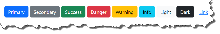
    <button type="button" class="btn btn-primary">Primary</button>
    <button type="button" class="btn btn-secondary">Secondary</button>
    <button type="button" class="btn btn-success">Success</button>
    <button type="button" class="btn btn-danger">Danger</button>
    <button type="button" class="btn btn-warning">Warning</button>
    <button type="button" class="btn btn-info">Info</button>
    <button type="button" class="btn btn-light">Light</button>
    <button type="button" class="btn btn-dark">Dark</button>
<button type="button" class="btn btn-link">Link</button>-
Output :
Bootstrap Outline Button
-
Documentation URL : https://getbootstrap.com/docs/5.3/components/buttons/
-
Code Snippet :
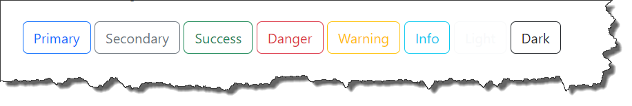
    <button type="button" class="btn btn-outline-primary">Primary</button>
    <button type="button" class="btn btn-outline-secondary">Secondary</button>
    <button type="button" class="btn btn-outline-success">Success</button>
    <button type="button" class="btn btn-outline-danger">Danger</button>
    <button type="button" class="btn btn-outline-warning">Warning</button>
    <button type="button" class="btn btn-outline-info">Info</button>
    <button type="button" class="btn btn-outline-light">Light</button>
<button type="button" class="btn btn-outline-dark">Dark</button>-
Output :
Bootstrap Button Size
-
Documentation URL : https://getbootstrap.com/docs/5.3/components/buttons/
-
Code Snippet :
    <button type="button" class="btn btn-primary btn-lg">Large button</button>
    <button type="button" class="btn btn-primary">Default button</button>
<button type="button" class="btn btn-primary btn-sm">Small button</button>-
Output :

Bootstrap Button Group
-
Documentation URL : https://getbootstrap.com/docs/5.3/components/button-group/
-
Code Snippet :
<div class="btn-group">
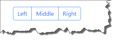
<button type="button" class="btn btn-primary">Left</button>
<button type="button" class="btn btn-secondary">Middle</button>
<button type="button" class="btn btn-success">Right</button>
</div>-
Output :

Bootstrap Link Button Group
-
Documentation URL : https://getbootstrap.com/docs/5.3/components/button-group/
-
Code Snippet :
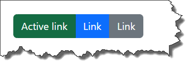
    <div class="btn-group">
        <a href="#" class="btn btn-success active">Active link</a>
        <a href="#" class="btn btn-primary">Link</a>
        <a href="#" class="btn btn-secondary">Link</a>
</div>-
Output :
Bootstrap Outlined Button Group
-
Documentation URL : https://getbootstrap.com/docs/5.3/components/button-group/
-
Code Snippet :
    <div class="btn-group">
        <button type="button" class="btn btn-outline-primary">Left</button>
        <button type="button" class="btn btn-outline-primary">Middle</button>
        <button type="button" class="btn btn-outline-primary">Right</button>
</div>-
Output :
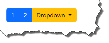
Bootstrap Nesting Button Group
-
Documentation URL : https://getbootstrap.com/docs/5.3/components/button-group/
-
Code Snippet :
    <div class="btn-group">
        <button type="button" class="btn btn-primary">1</button>
        <button type="button" class="btn btn-primary">2</button>

        <div class="btn-group">
            <button type="button" class="btn btn-warning dropdown-toggle" data-bs-toggle="dropdown">
                Dropdown
            </button>
            <ul class="dropdown-menu">
                <li><a class="dropdown-item" href="#">Dropdown link</a></li>
                <li><a class="dropdown-item" href="#">Dropdown link</a></li>
            </ul>
        </div>
</div>-
Output :
Bootstrap Checkbox Button Group
-
Documentation URL : https://getbootstrap.com/docs/5.3/components/button-group/
-
Code Snippet :
    <div class="btn-group">
        <input type="checkbox" class="btn-check" id="btncheck1" autocomplete="off">
        <label class="btn btn-outline-primary" for="btncheck1">Checkbox 1</label>

        <input type="checkbox" class="btn-check" id="btncheck2" autocomplete="off">
        <label class="btn btn-outline-primary" for="btncheck2">Checkbox 2</label>

        <input type="checkbox" class="btn-check" id="btncheck3" autocomplete="off">
        <label class="btn btn-outline-primary" for="btncheck3">Checkbox 3</label>
</div>-
Output :

Bootstrap Radio Button Group
-
Documentation URL : https://getbootstrap.com/docs/5.3/components/button-group/
-
Code Snippet :
    <div class="btn-group">
        <input type="radio" class="btn-check" name="btnradio" id="btnradio1" autocomplete="off" checked>
        <label class="btn btn-outline-primary" for="btnradio1">Radio 1</label>

        <input type="radio" class="btn-check" name="btnradio" id="btnradio2" autocomplete="off">
        <label class="btn btn-outline-primary" for="btnradio2">Radio 2</label>

        <input type="radio" class="btn-check" name="btnradio" id="btnradio3" autocomplete="off">
        <label class="btn btn-outline-primary" for="btnradio3">Radio 3</label>
</div>-
Output :

Bootstrap Vertical Button Group
-
Documentation URL : https://getbootstrap.com/docs/5.3/components/button-group/
-
Code Snippet :
    <div class="btn-group-vertical">
      <button type="button" class="btn btn-primary">Button 1</button>
      <button type="button" class="btn btn-primary">Button 2</button>
      <button type="button" class="btn btn-primary">Button 3</button>
      <button type="button" class="btn btn-primary">Button 4</button>
</div>-
Output :
